The Paint Library
Popular Australian wall colours, with the two things a colour chart never tells you: which way each one leans, and how much light it gives back. Pick one, then use the Visera app to see a colour on your own wall, in your own light.
A painted A4 card in a shop lies to you. The same colour reads warmer under a north-facing window and greyer under an LED downlight — which is why the colour you chose in-store so often looks wrong at home.
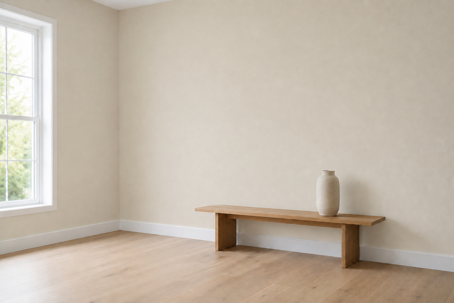
Every colour, the same room
Each colour is shown in the same fixed room and camera across four lighting conditions, so you can compare how the walls change without the scene changing underneath you.
Afternoon · Clear, near-neutral daylight.
Hover or focus any colour below to change the room image.
Illustrative render, not a measurement or a Visera capture: the sample room and its lighting are AI-edited images of one fixed room. The swatches are on-screen approximations — always confirm against a physical sample.
Match a colour
Got a cushion, a tile, or a photo you want the walls to sit with? Pick the colour and we will rank the closest matches in this library using CIEDE2000 — the same perceptual colour-difference formula the Visera app uses.
Lower ΔE means a closer match. Under 2 is hard to tell apart.
Whites & Off-Whites
The most-asked-for wall colours in Australia.
Neutrals & Greige
Warm stone, sand and greige for whole-home schemes.
Greys
Mid-tone greys that hold their colour in low light.
Charcoals & Black
Feature walls, joinery and exteriors.
Greens
Muted, Australian-landscape greens.
Blues
Deep blues for feature walls and front doors.
Reds & Earth
Heritage reds and warm earth tones.
No colour in the library matches that.
Samples you can stick on the wall
Peel-and-stick sample squares are in development. Until they exist we are not taking orders for them — you can try colours free in the Visera app today, and buy a real sample pot from a retailer using the link on each colour page.
Shop the furniture collection